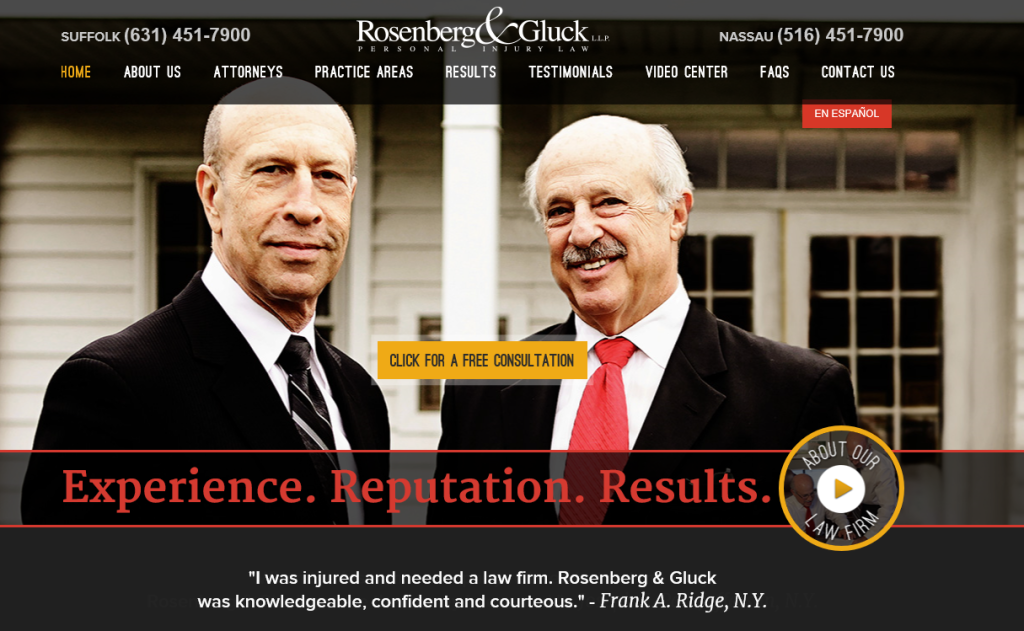
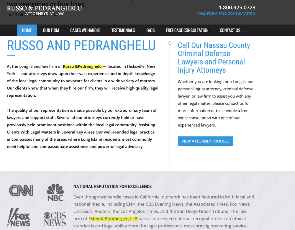
Incredibly the quote above comes directly off the home page of Long Island web design company Tech ACS Corp. It came to my attention today that Tech ACS Corp. is stealing designs from ilawyermarketing. Now I have come to expect that many web site firms are copying iLawyermarketing’s unique style, but this is altogether different. The sheer boldness of the theft is breathtaking. Not only did they copy every aspect of the design, they also copied the content. Below I compare the home page from the ilawyermarketing client Rosenberg & Gluck and compare it to the new website http://www.pilawyerny.com/ from Russo & Pedranghelu on the right.

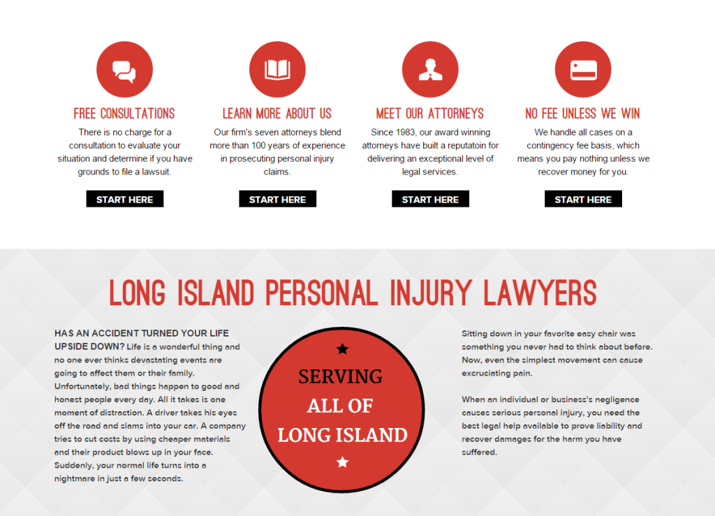
Pretty similar right? It gets worse as you scroll down. Here they completely copy our buttons. Worse they copy the content word for word. Was this an intentional effort to sink Rosenberg & Gluck in the rankings? But lets give the Tech ACS design team credit for making the brave design choice of a box versus the circle below:
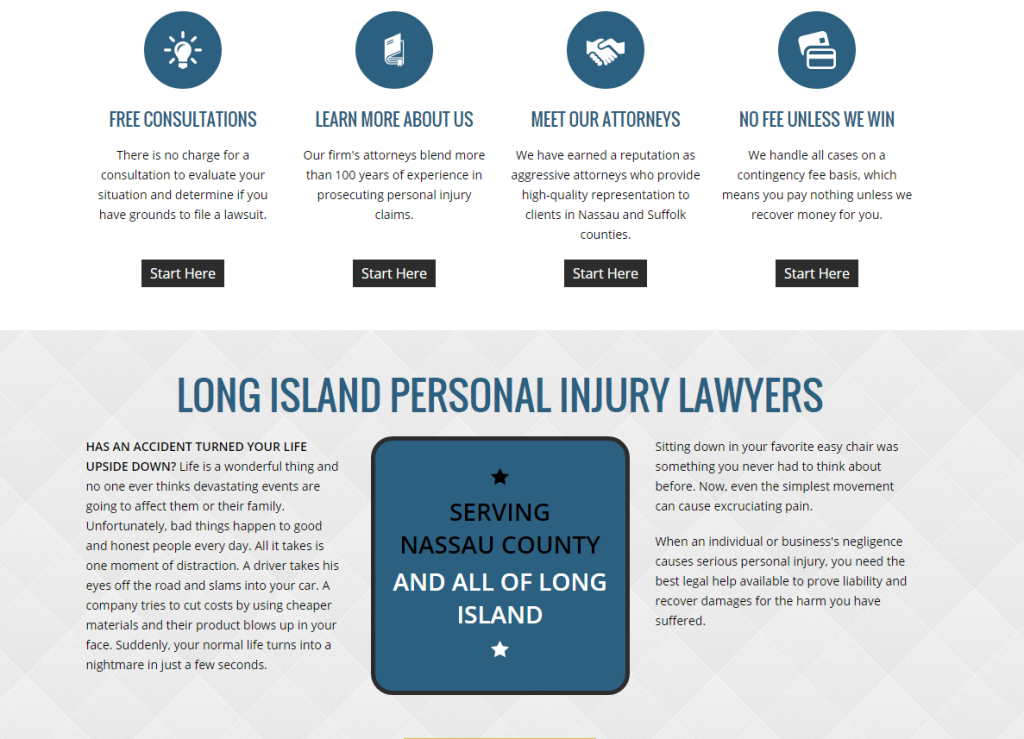
What is shocking to me is that they would do this in Long Island where Rosenberg & Gluck practices. Did they think no one would notice?
Once Again – here we have the original ilawyermarketing site on the left and the copied version on the right:
But this isnt the only offense. Here they lifted another one of ilawyermarketing’s sites www.ebtrialattorneys.com. Tech ACS’s version is a carbon copy – http://rplaw.geekny.net/ . In fact the theft is so blatant, they forgot to take out the name of the firm they stole from. Besides stealing their design, copying the content could have serious Panda implications for our client and the new firm. What a joke!
But wait there is more! Here the “web designers” from Tech ACS Corp – steal from our Kansas City client Dickerson Oxton . Notice how similar the Practice area menus look? The frauds at Tech ACS Corp just rearranged the order, not even bothering to create their own buttons. This stolen site design belongs to the NY law firm of Levine and Wiss. I wonder if they are aware that they paid a website company to simply steal the design from someone else? If they are….shame on them.
All of the websites at our company are custom. Our clients pay for and expect a unique website design. Meaning that we start with a new concept all of the time. Sometimes clients look at our portfolio and ask for a website “just like that”. While an existing website can serve as inspiration, we still have to come up with something new and different with each and every design. Unlike large companies that churn out hundreds of websites each month, we might release 5. For us every website design is a labor of love, with our designers and developers poring over every detail. Little things matter. Taking the time to come up with a unique and memorable way to organize practice areas like in the above example is what separates a great design company from an average one.
There will likely be some legal consequences for the Tech ACS Corp. I wonder how much money this sham company made on the backs of our designers. Ironically, I see from their portfolio that Tech ACS Corp created a website for a copyright attorney: http://www.copyrightenforcers.com/ I wonder if they stole that design too?
*Update
As of this morning the site pilawyerny was taken down. Interestingly while we have not heard back from Tech ACS, they have removed all of their Legal sites from their portfolio. In addition, the Law Firm of Levine and Wiss took down their copied design as well. However, evidence of the theft remains here: http://techacs.com/work/lawpllc/

